The laws of shitty dashboards
Disclosure: I have been responsible for building shitty dashboards. I personally made most of the errors below. I heretofore apologize to my users and pledge not to do it again. Hopefully, these anti-patterns can help PMs, designers and engineers reduce a bit the amount of time wasted building and looking at shitty dashboards.
Law #1: Most software dashboards are shitty
When I say shitty, I’m not talking Google Image Search-bad (done vomiting yet?). I mean shitty in the sense of boring, poorly designed and devoid of any usefulness whatsoever.
Don’t believe me? Name 3 good software dashboards, right now
Found anything? Yeah, I guessed so. Yet, they’re everywhere. Any SaaS software you’re using probably has one, most likely as its home page.
You probably never look at it. It’s as if they weren’t there. (I call this dashboard-blindness). Thus, so, most software dashboards are shitty.
Side note: I’m talking trash about software here, but the law could be extended to all dashboards.
Take car dashboards for example. They use vast amount of real estate to display information that is useless 99% of the time. How often do you need to know the RPM on an automatic car? Can’t you just take that stupid dial out and put something useful instead?.
They also employ UX techniques that dates from a time where the only UI component you can use was a light bulb. If that red thing is critical, can’t you tell me right away what it means?
But since we can’t solve all of it, let’s focus on software.
Law #2: If it’s called “Dashboard”, it’s probably shitty#
If your collection of data widget is called “Dashboard” it probably doesn’t serve any purpose other than being there and moving. Which means it’s useless.
Corollary: “Let’s build a dashboard” equals “Let’s build a shitty dashboard”# I don’t have the data to prove it, but I bet a lot of shitty dashboard started with the sentence “we need to add a dashboard”.
They are built without the users in mind because the product team has a bunch of numbers that they think could be useful. Or because the exec team somehow thinks “we need a dashboard”.
Law #3: If you don’t know what to take away from your dashboard, your users won’t#
I’ve been guilty of this one. Once, as a PM, I flat out answered the question “what is the use of your dashboard?” with a vapid “It tells the users what her numbers are”. Yeah…
It’s a classic fallacy. You have no idea what your users will decide based on the data you are showing them. But you somehow assume your users will know. Except you’re the one spending days and nights with the product and the data. If you (the PM or designer) doesn’t know what the data on the dashboard means and what to make of it, your users won’t either.
Corollary: A dashboard that does not take a stand is a shitty dashboard
What the hell am I looking at? Does the designer has any idea what’s important here?
That’s the “let’s throw some spaghetti at the wall and see what sticks” approach. What you end up with is a giant mess on the floor.
Law #4: Not talking to users will result in a shitty dashboard
The twin brother of Law #3. You don’t know if the dashboard is going to be useful. But you don’t talk to the users to figure it out. Or you just show it to them for a minute (with someone else’s data), never giving them a chance to figure out what the hell they could do with it if you gave it to them.
(You can substitute “product” for “dashboard” and law #4 still holds true)
Law #5: I don’t need no shitty control
Also linked to law #3. Since you have no idea what anyone is going to do with your dashboard, why not throw more controls, to let the user figure it out?
The funny consequences of this one:
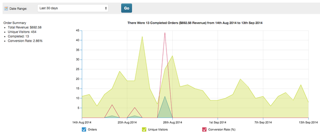
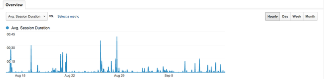
The user still doesn’t have the faintest idea of what he’s supposed to look at You now offer combinations that are even more useless. My eternal gratitude to anyone who can tell me what to do with session duration at the hourly level. “People at 4:53AM on Monday stayed longer on the site than at 11:36AM”? So what?
Another other reason why stupid controls get added is because some user (most likely a data guy) asked for it. Unless you’re building a product for him, don’t listen to the data guy
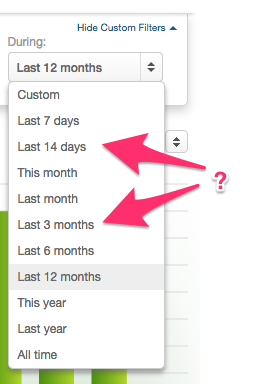
Special mention to my favorite, the “last 14 days” option.
Law #6: Because it was useful in a Powerpoint doesn’t mean it’s useful on a dashboard#
Another fallacy is to think that because some graph is useful in a quarterly Powerpoint it will be useful to look at every day. Surprise: quarterly numbers don’t change that much day-to-day. Although it’s useful, it’s also incredibly boring.
Law #7: Because it moves doesn’t mean it’s not shitty
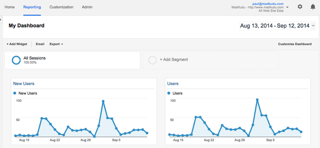
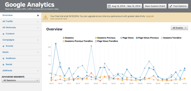
Dashboard hell is paved with last 30 days daily numbers.
Can you think of a single application where that timeframe / granularity is actually useful? Most KPIs (traffic, revenue) are too volatile on a daily basis to be useful. Yet “last 30 days daily” is more or less the default option.
The reason are pretty easy to understand: The numbers will move. If the users comes back tomorrow, there will be a different number.
Excitement!
Dopamine rush!
Then, best scenario: nothing. Because whatever that daily number tells you, you don’t know what to make of it.
Worse case scenario: a bad decision taken with non-statistically significant data.
Yes, 30-day daily graphs look way better than a single KPI with a trend indication. But they’re a lazy option.
Corollary: No one needs real-time
Or near real-time. Or whatever you call it.
Real-time is the über version of #6. More dopamine, no actionable data whatsoever.
Law #8: You probably don’t need a dashboard
If you can’t think of a reason (besides “they can look at their number”) why your users would use your dashboard, then you don’t need a shitty dashboard.
If your data is only useful on a monthly basis but doesn’t move much in between, maybe you don’t need a shitty dashboard. Send your numbers by email the end of the month instead. Sure, you can still build a shitty dashboard, but don’t complain that no one looks at it.
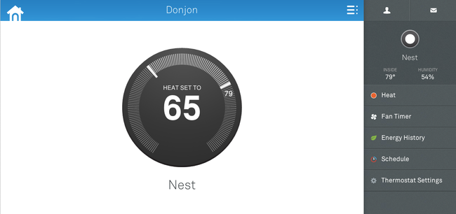
Nest does this pretty well. They send you your monthly usage numbers every month, yet you can’t find that info on the site. You wouldn’t look at it if you had it, would you?
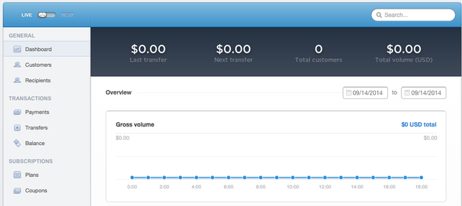
Yes, back-end applications need ways to show their users that they’re working. I guess that’s the reason behind Stripe’s (otherwise pleasantly understated) dashboard:
Just ask yourself if a dashboard is the best way to achieve this. If something’s going awry (or well), shouldn’t you send me an email or text instead?
There are already a lot of shitty dashboards out there. Please save the planet, don’t create more.
Think I’m biased and could think about 3 good dashboards without looking? Tell me so on twitter!